
|
|||
           Hello everyone! To give you a feel of the game, I'd like to guide you through our interface. We loved the original look and feel of the mod version, however it was rather limited by engine and interface restrictions in GoldSrc modding (for the main menu at least). And after all, we aren't simply porting a mod, we're making a true game in the spirit of 3D accelerated shooters of the early 2000s! 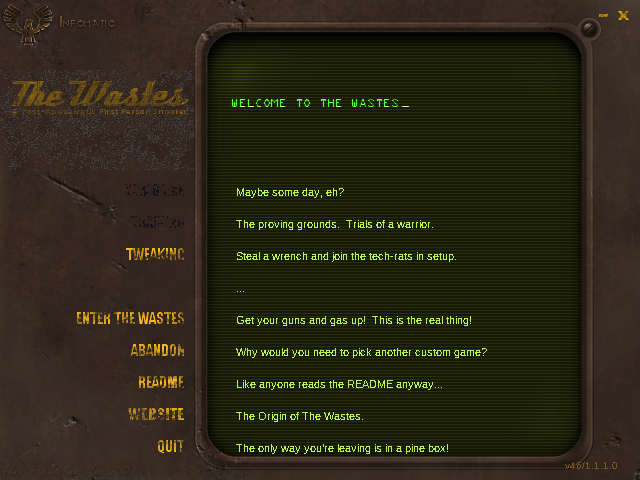 Pictured above: The original mod menu.
We loved the idea of the screen-interface that the mod tried to implement. Sadly Half-Life didn't really allow you to modify the layout of elements back then. So we went to the drawing board and tried to create something with a familiar look but a refined feel that'd beat the original design of not just the mod, but the game it was made for. 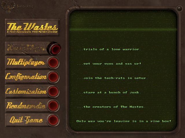 Pictured above: Game version, with a hint of skeuomorphism.
If you're going to put in a screen, we figured it needed some buttons as well. Those buttons on the left provide an easy way for you to go through the main menu categories. Inside those categories you'll find sub-menus which will be remembered for when you switch between categories - giving fast access to all essential options. That's something the original menu didn't do, because you'd have press "Back" many, many times in order to go from graphics options to let's say, creating an Internet game. 


The spawn menu was quite messy. The GoldSrc VGUI menus are a great framework, but the mod implementation lacked personality that the mod needed. Supporting multiple resolutions properly also required fiddling to get the layouts just right, so in the end compromises were made. We went back and looked at some of the ideas the team had and came up with a much more unified design with a less drab interface. 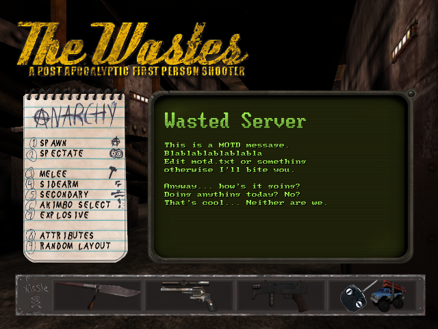 Combining main interface and message of the day into one.
We also made it so that the current layout is very clearly visible. 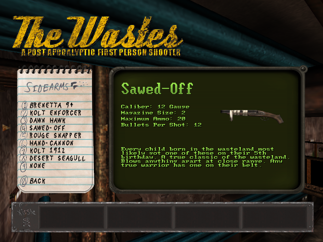
Here you can also see what displaying weapon information looks like . We're still refining that one to give more helpful information about the Primary/Secondary/Tertiary weapon functions. So stay tuned. 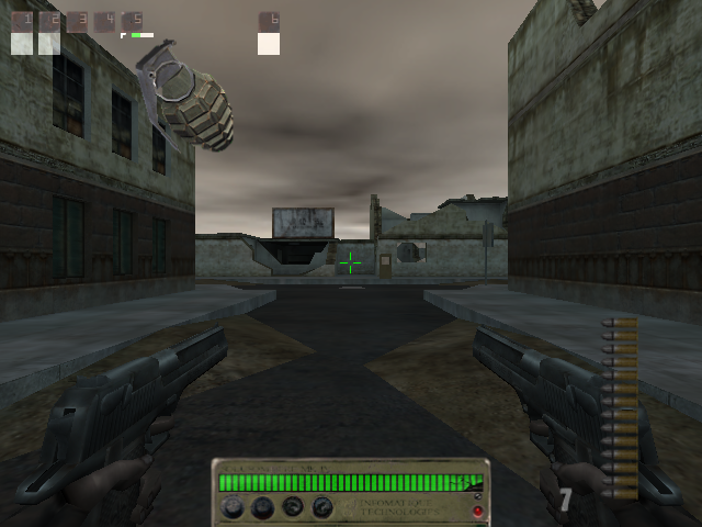
The mod sported a very big heads-up-display at times. While we liked the look, we did want to minimize the default configuration a little bit to be not as overwhelming. 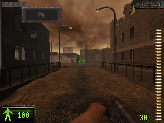 Pictured above: Same place, over 15 years later.
The heads-up display of course, is not just that single design. No way. 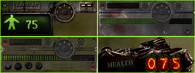
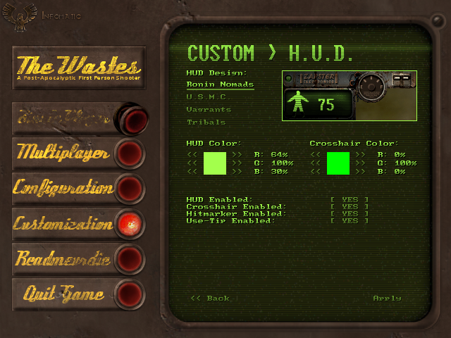
We offer players the ability to customize the look and feel as much as possible, while not over complicating things too much. We had the idea of creating one design for every faction in the game's lore... so we're giving you, the player, free rule to choose whatever design you want. You can choose the interface colors as well. With more options to be added. 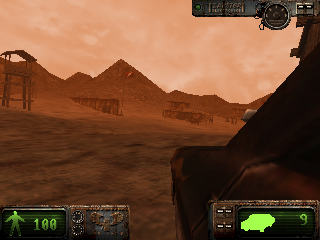
Going into a vehicle expands the interface to its full size. With all the gauges, bells and whistles attached. 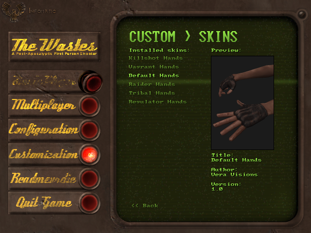
We love the idea of making the game modifiable without having to tinker around the internals too much. We'll be shipping with a simple plug-and-play system to installing and choosing skins for the player hands and eventually weapon designs as well. We've got a lot of content you'll be able to pick and choose so that you can make the game your own. We hope all of you will create amazing skins and content using the system in place. This was a quick overview about the look and feel of the interface. There are of course lots of minor elements we couldn't cover (we also don't want to spoil any surprises!). And if you haven't, please wishlist The Wastes on Steam!  Back Back |
Last updated Fri Nov 15 16:27:05 UTC 2024
|
© 1999 - 2023,
Vera Visions LLC.
All rights reserved.
The Wastes and The Wastes logo are the property of Vera Visions LLC. All other trademarks are the property of their respective owners. |
 |


 Windows
 Linux
Linux

